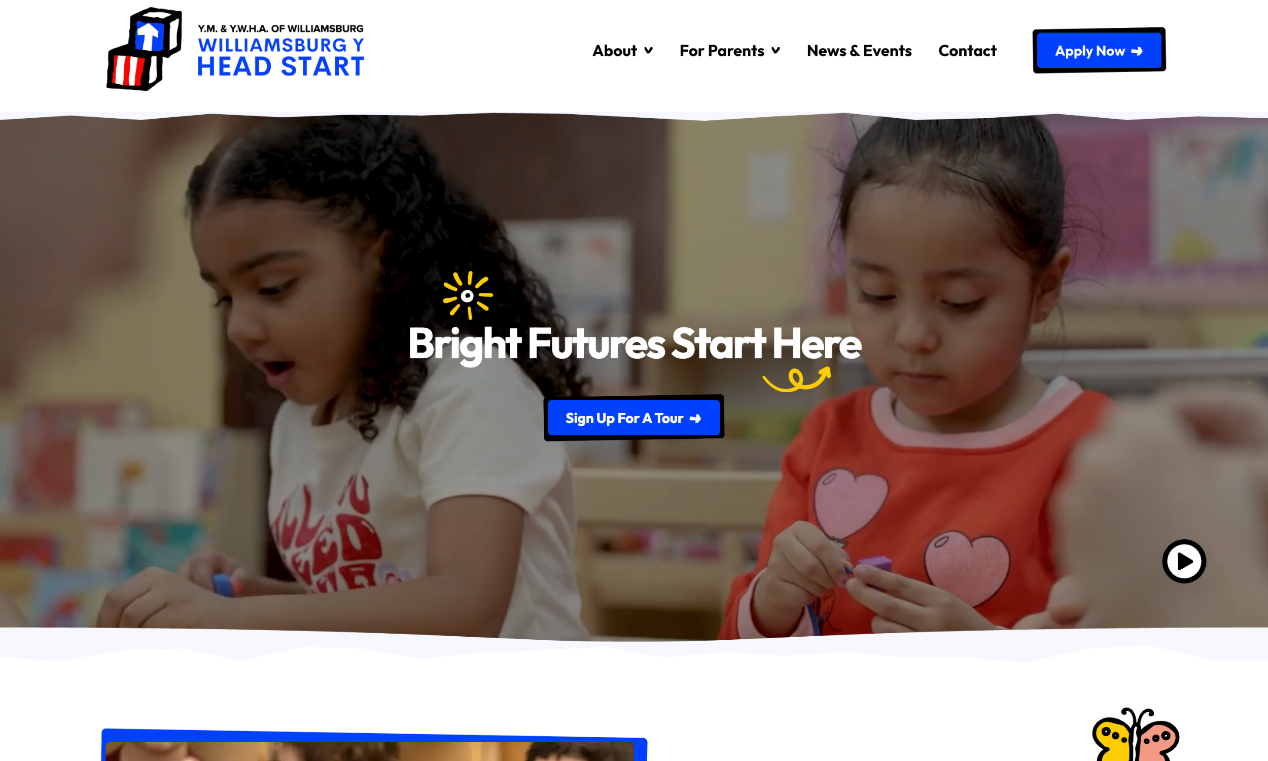
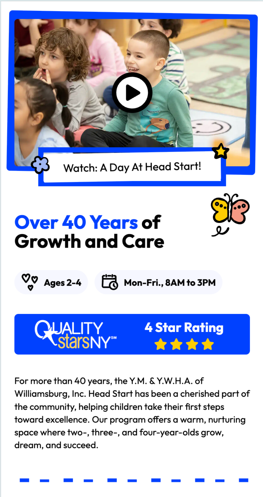
Finding the right preschool can feel overwhelming for parents, especially when budgets are tight and options are limited. For Brooklyn families in Greenpoint, Williamsburg, and Bushwick, Williamsburg Y Head Start has been a trusted answer for more than four decades. Their classrooms give two-, three-, and four-year-olds from low-income households the structure, care, and support they need to thrive.
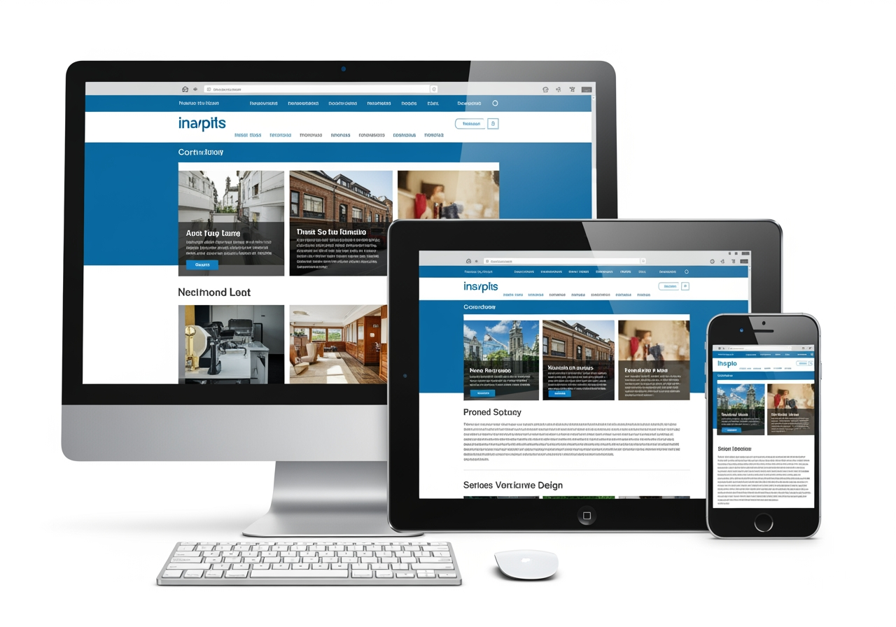
However, the website user experience didn’t match the warmth of the actual program. Their target market of parents with young children couldn’t navigate the site easily or find relevant content. After meeting with a few NYC website design agencies, Williamsburg Y Head Start chose to work with our team at e9digital because they liked our proposal the best. We have worked with many education organizations before, including Lead to Empower and Admissions Helpers. For us, the project was all about staying true to their well-established brand and reorganizing the content to make it easier to add new information.
“You and your business are onstage non-stop. Your website, what you wear to a meeting or a Zoom call, or the props that you have all need to be consistent with the story that we’re presenting on stage.”
— Conrad Strabone, Managing Partner and President | e9digital
Brand consistency can increase revenue by up to 33%
When a company comes to us with an established brand that works, we don’t bulldoze it. We build on it. For Williamsburg Y Head Start, they had a playful, memorable logo: bold red and blue with hand-drawn block shapes. We leveraged that visual language through every element of the site and widened the color palette so it felt educational. Blue CTA (call to action) buttons. Whimsical borders around photos. Design details that feel approachable and child-focused, not corporate.
Parents want to see a preview of the learning experience their child could have at school. To give them a taste of a day-in-the-life of a child at Williamsburg Y Head Start, the hero video plays a ten-second loop of children playing. Additionally, parents can easily access the 11-minute virtual tour straight from the homepage. Both of these encourage parents to take the next step and sign up for an in-person tour.
Every decision on this site was made with busy parents in mind. The user experience follows our core e9digital principles:
- Clear content structure that lets users scan section headers and get the big picture fast.
- A top navigation bar with drop-downs so parents can find specific documents and internal pages faster.
- Hover animations that cue parents to click on CTAs and learn more.
- Real testimonials that create trust and showcase success stories
- ADA compliance to ensure every parent can access the site with ease.
A 714% increase in website sessions in the past 90 days
This project was about empowering families with better access to early education by creating a website that feels just as nurturing, thoughtful, and trustworthy as the classrooms themselves. With a restructured layout, engaging visuals, and strategic UX enhancements, the new site connects with parents emotionally. The numbers don’t lie: we’re proud that the site has seen a 714% increase in website sessions and 608% increase in total website viewers in the past 90 days.
If your organization’s mission is bold but your website is behind the curve, e9digital can help. From nonprofits to enterprise clients, we build digital platforms that tell your story, strengthen your brand, and deliver real-world results. Contact us today, and we can help craft your story that engages your target audience.
“The goal of every one of our clients’ websites is straightforward and simple: can we get more sales leads? So we help them do that.”
— Conrad Strabone, Managing Partner and President | e9digital