If you’ve ever tried to decide what restaurant to eat at without Yelp, it feels like gambling–you have no idea what the end result will be. Agriculture, Urban Planning, Insurance, and Environmental Agencies had a similar issue with land forecasts–they need premium data to drive decision-making.
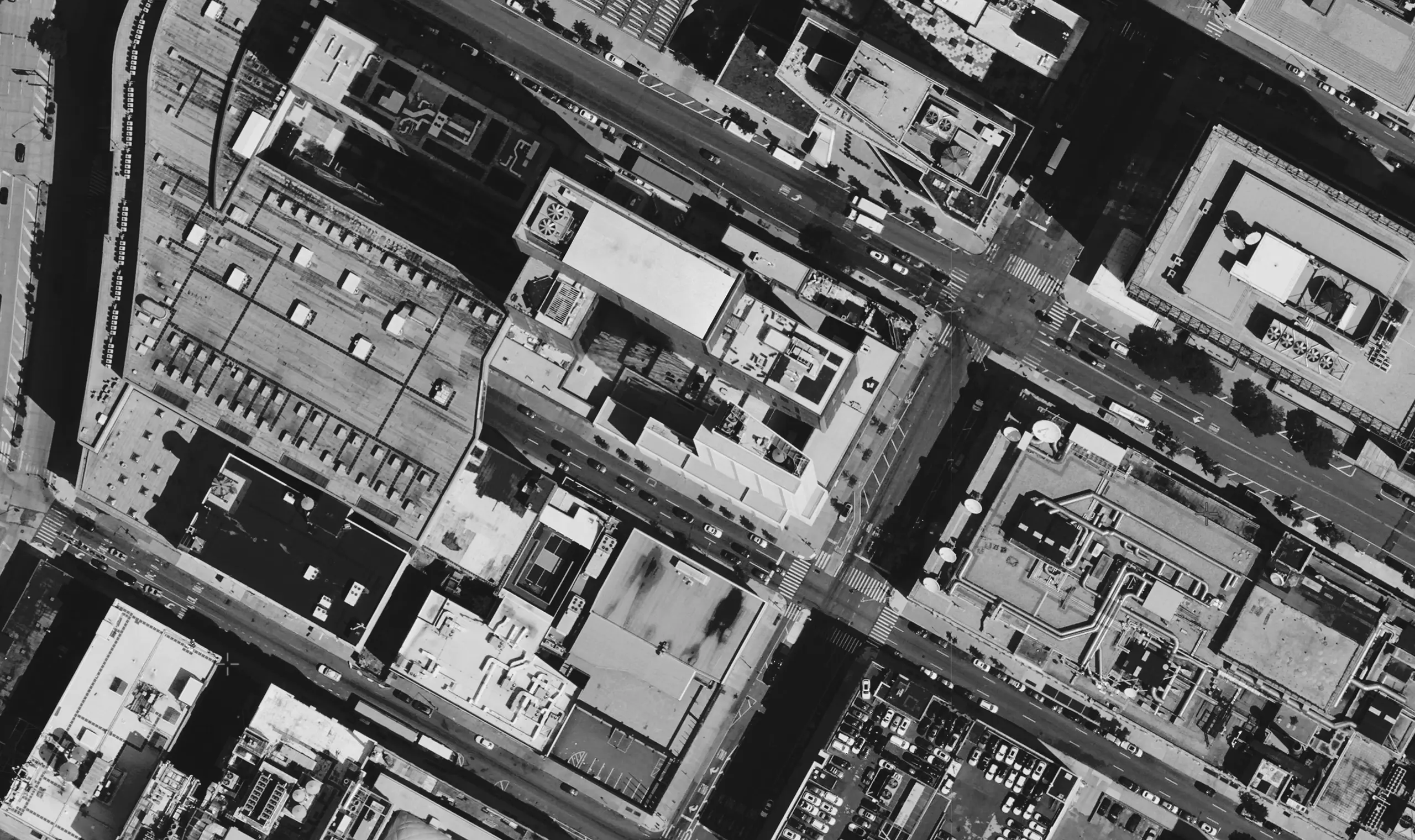
And it’s on the way, thanks to EarthDaily Analytics. The company offers impressive analytics of Earth through machine learning. They’re building proprietary satellite technology that fully automates daily geoanalytics on a global scale, providing images of 92% of the Earth’s surface daily via a pearl necklace of satellites.
The company needed a digital agency to help ASAP with a new logo and migrate the current website, making updates and retiring their previous brands. For this project, our focus was to identify the core values of EarthDaily Analytics’ new brand and deliver a brand logo to help the company live long and prosper!
“With any great logo, it’s setting the stage for future marketing endeavors and building a whole brand around it.”
– Jason Solak, Senior Production Manager | e9digital
Creatively breaking boundaries while staying true to industry expectations
Many satellite companies use satellite imagery in their branding, which makes sense but can feel stale due to overuse. EarthDaily Analytics wanted to shy away from that in their logo and stay true to their customer base. The needs of their target audience are very cut and dry–they require enterprise global change detection through data and analytics.
The logo had to highlight the amazing technology that captures data and translates it to speak to their target audience. We initially presented 12 designs, all attacking at different angles of what EarthDaily Analytics wanted to see in a logo. In the end, EarthDaily Analytics chose the logo where our lead designer took inspiration from the pearl necklace of satellites.
- Three dots orbit the Earth, offering depth with the horizon line.
- Light shape of the eastern and western hemispheres.
- Radiating circles come out of the shape.
- The fingerprint effect is a subtle illusion of the fingerprint of the Earth the company captures daily.
- An appealing blue color scheme with a bold color contrast.
- A clean, modern typeface that’s appealing on the page.
Ultimately, we produced a simple yet recognizable logo that’s personal and speaks to the target audience. It reminds them that when they work with EarthDaily Analytics, they can access daily geoanalytics on a global scale.
Aligning our skills with client needs to complete a successful project
At e9digital, we offer plug-and-play services to meet your company’s exact needs. EarthDaily Analytics didn’t need a website redesign, they needed a migration with tweaks here and there to reflect their new branding. Our designated project manager made the process a breeze, ensuring all design changes were implemented by our team, including:
- The addition of the logo in the hero image on the home page for brand recognition.
- Swapping out the logo and colors to reflect the new design for a visually appealing layout.
- Removing irrelevant copy and materials to simplify the user experience.
Additionally, we created a brand guideline one-pager reflecting the choices from the new logo, business cards, and an email signature for their team. Our talented designers have a lot of tricks up their sleeves!
We work with clients of all shapes and sizes to produce logos, websites, and other marketing materials to elevate your business. If you need highly logical design services, contact our team to help create a game plan that appeals to your target audience today.
“We do great design, we do great marketing, we program great websites, but really, what we build are ATMs. We help our clients have a machine for making money.”
— Conrad Strabone, Managing Partner & President | e9digital