Public schools produce over 14,500 tons of waste every day, and most of that comes from the lunchroom. Cafetaeria Culture (CafCu) is here to change that. This NYC-based nonprofit helps school cafeterias battle food waste, kick plastic pollution, and promote local composting. They offer free toolkits designed to help schools reduce cafeteria waste.
While their work in schools has eliminated over 22 million items of single-use plastic from school lunches, their website didn’t reflect their powerful initiatives. Built when they were a small volunteer-run organization over a decade ago, the site no longer captured the scope or success of their work.
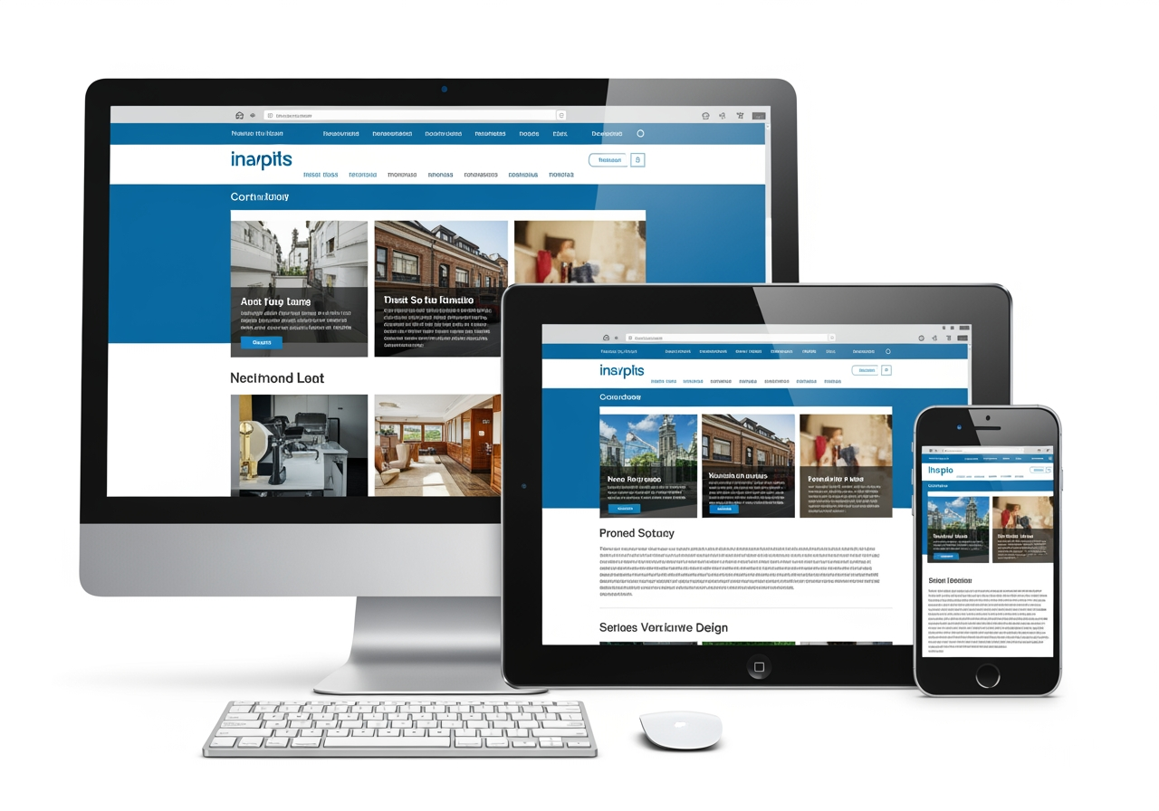
A lot of our business at e9digital comes from referrals. Our current client, UpClear, sent CafCu to us for a new design that would speak to their target market of principals, teachers, parents, and students in public elementary, middle, and high schools. The nonprofit wanted something visually engaging, easily maintained, and structured to grow with their expanding mission.
“Consistency in look and feel is critical. Everything, 100% of everything, needs to be part of a unified brand package. Every element has to tell the same story.” — Conrad Strabone, Managing Partner and President | e9digital
75% of people recognize a brand by its logo
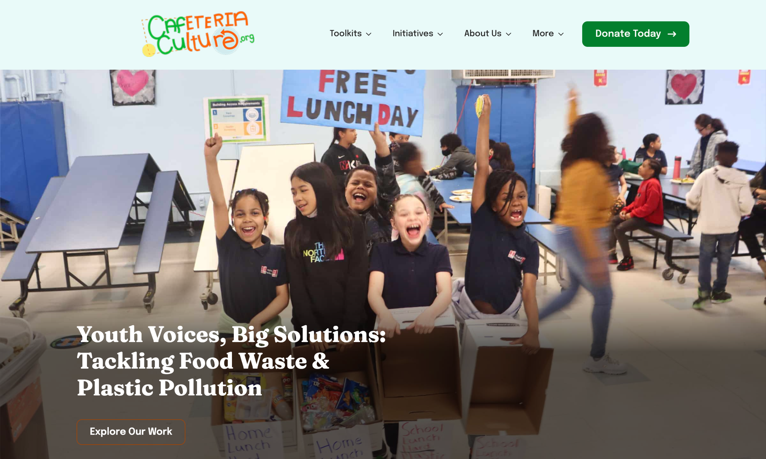
Our design team’s goal was to maintain the original brand. We didn’t want to move away from what CafCu had already built, but rather help it graduate into the next era. Our website designer did just that by leveraging the logo, applying the same color palette and iconography across the site in calls to action (CTAs), backgrounds, and other design elements.
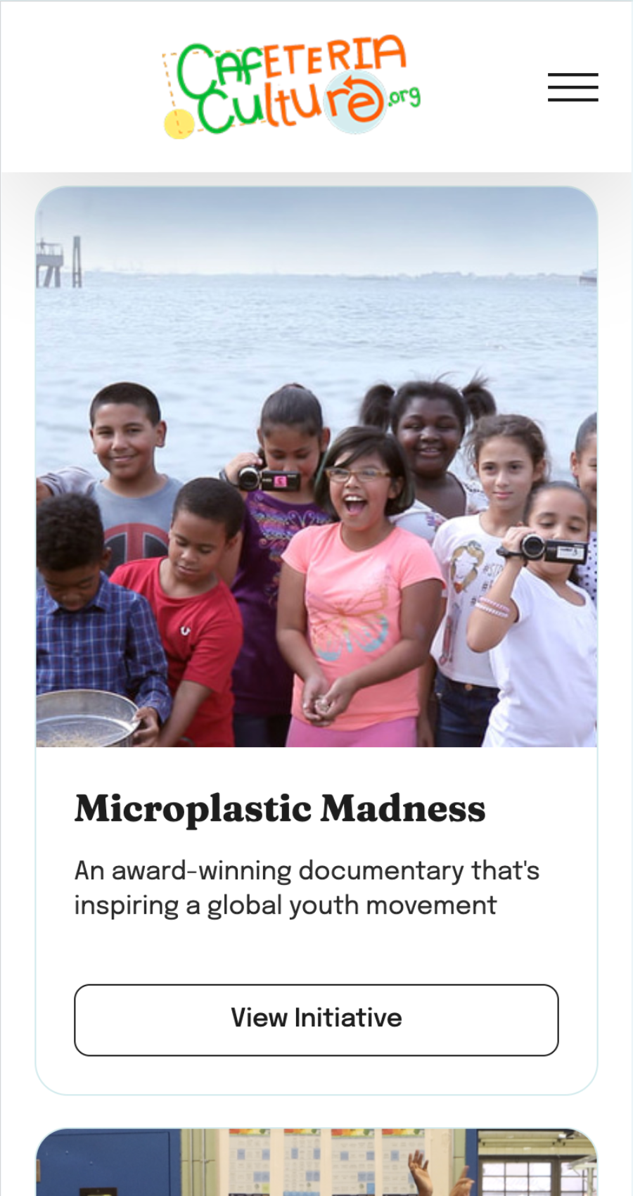
Photography from the nonprofit’s work adds texture and context from the first click. A slideshow as the hero image shows potential educators the excitement and impact of CafCu’s programs as soon as they hit the homepage.
The redesign integrates e9digital’s UX best practices at every step:
- Sticky navigation keeps critical pages within reach no matter where users scroll.
- Expanded megamenus guide audiences directly to the tools and initiatives they’re looking for.
- Dual CTAs serve both educators and donors without distraction.
- Dedicated pages for every toolkit allow for fast, no-hassle downloads for quick classroom implementation.
- A footer on every page reinforces CTAs and gives users quick access to CafCu’s social channels and site sections.
With the updated UX, navigation is faster, content is easier to access, and every page is built to guide educators, parents, and funders through the full story of their impact. From megamenus to accessible color palettes, this relaunch gives CafCu a platform that supports their national reach and their grassroots work inside classrooms.
“The website is really great. The flow has a good story. It looks amazing, I love it.” — Atsuko Quirk, Digital Media Producer and Cafeteria Ranger Program Director | CafCu
CafCu’s redesigned site brings their mission into sharper focus. With a vibrant design inspired by their established brand, the interface now matches the energy of their student-led programs and climate-forward goals. Our designer also created a tutorial video showing the nonprofit how to edit their site, so they can add content and pages whenever needed as their programs grow.
The new site has been incredibly successful, with a 203% increase in website sessions and 128% increase in total website users in the last 90 days.
If your website no longer reflects the strength of your mission or the scale of your work, e9digital is ready to fix that. We build digital platforms that work just as hard as you do. They’re strategic, scalable, and designed for real-world results. Let’s make your message impossible to ignore. Contact us today.
“We’re experts in what we do and have an opinion on how to do it. I don’t tell my accountant how to interpret tax law. We steer clients in the right direction to make their website engaging for their target market.”— Conrad Strabone, Managing Partner and President | e9digital